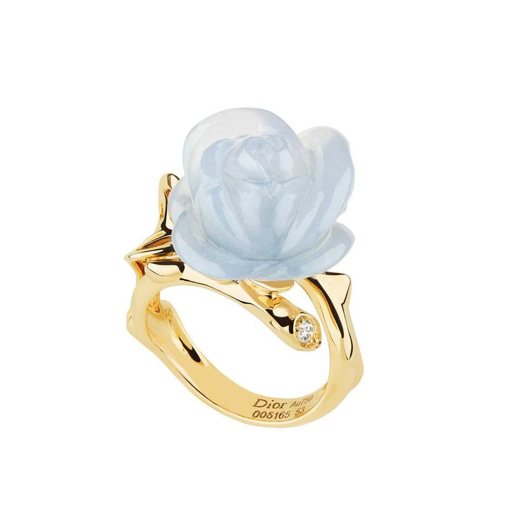
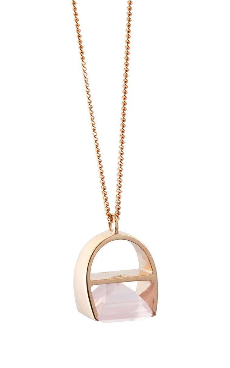
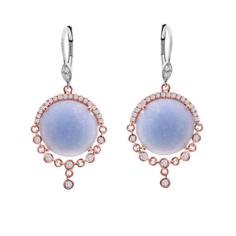
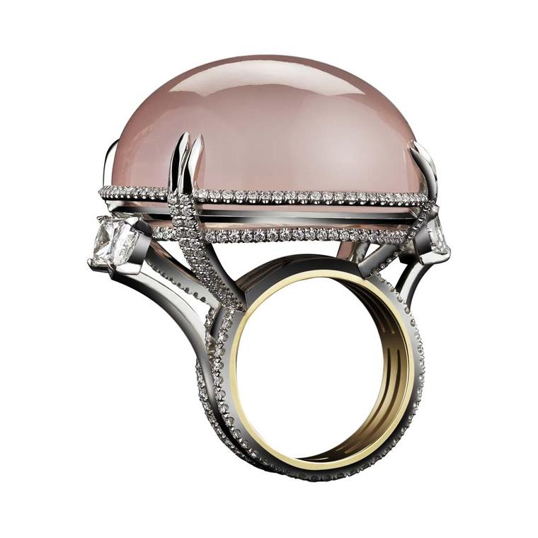
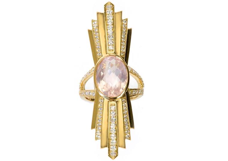
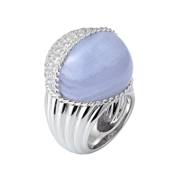
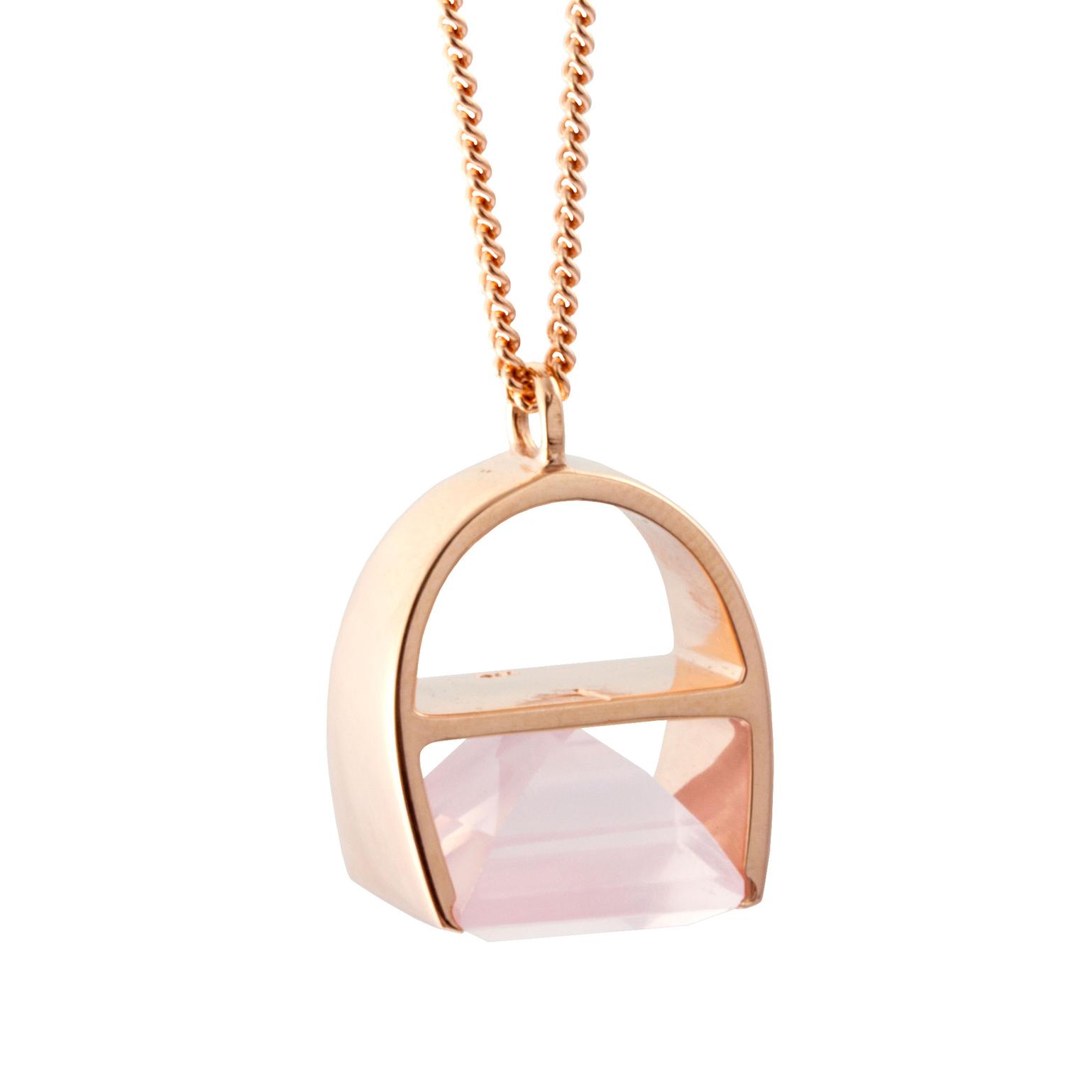
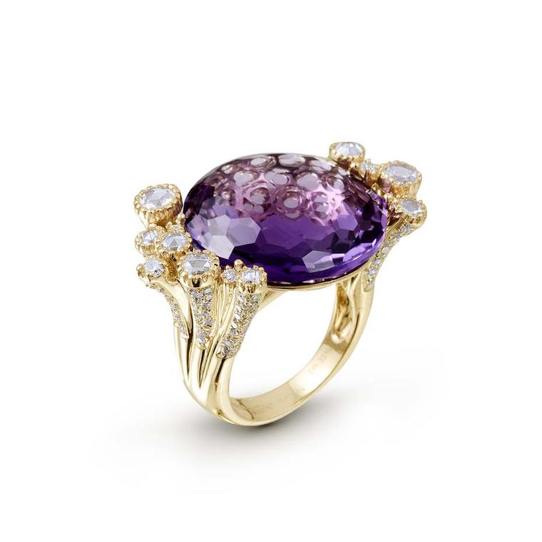
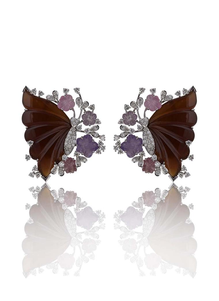
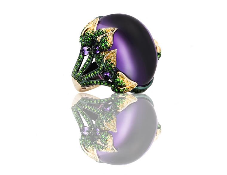
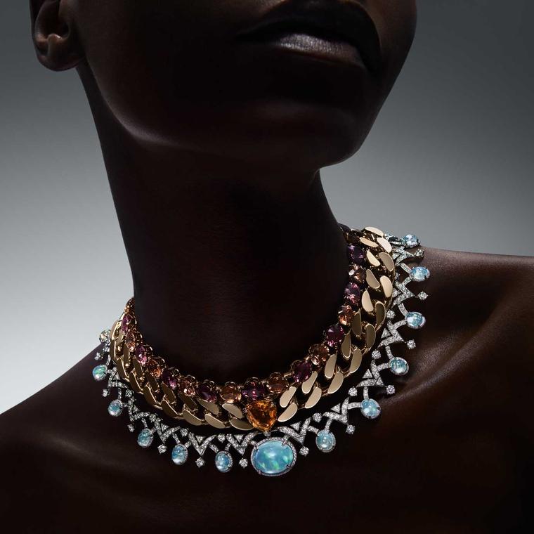
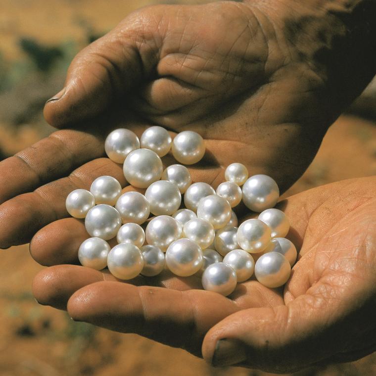
In an unexpected move, the Pantone Color Institute yesterday announced that, for the first time ever, there will be two colors of the year for 2016: Rose Quartz and Serenity. In stark contrast to last year's rich, reddy-brown Marsala, the pastel shades of pink and blue are a breath of fresh air - but not an entirely surprising choice at The Jewellery Editor since we predicted that pastel gems, particularly the "milky" stones like rose quartz, chalcedony and moon stone, are set to be big in the world of jewellery back in September.
Read about the trend for pastel gemstones here
Unlike the more obvious - and somewhat chilly - baby pink and blue, the 2016 colours are warmer and more nuanced. Dusky rose quartz is verging on nude, while serenity has lilac undertones. These are dreamy, relaxing tones and Pantone's prettiest predictions so far.
The Pantone Institute introduced its trend-led Color of the Year back in 2000 to predict what will be big in the worlds of fashion, interior design and beyond - including jewellery - in the year ahead. Cartier, Dior, Robinson Pelham, Carrera y Carrera and Rodney Rayner have all fallen under the spell of chalcedony in recent months, with Cartier's Paris Nouvelle Vague ring virtually identical to Pantone's chosen shade of blue known as Serenity. Meanwhile, Kattri, Brumani, Deborah Pagani and Alexandra Mor have perfectly captured the "gentle tone that conveys compassion and a sense of composure", which is how the team of colour experts at the Pantone Color Institute describe Rose Quartz.


