By Maria Doulton in London
The Pantone Color Institute® has announced that the colour of 2014 is to be Radiant Orchid. So as we bid farewell to Emerald Green, the colour of 2013, as we turn our sights to all things purple. Described as "an enchanting harmony of fuchsia, purple and pink undertones, Radiant Orchid inspires confidence and emanates great joy, love and health. It is a captivating purple, one that draws you in with its beguiling charm."
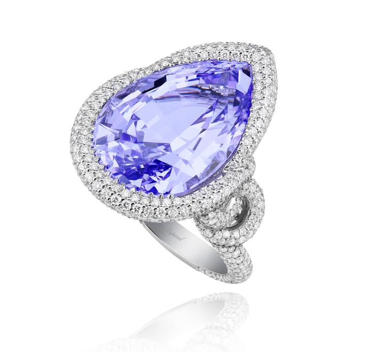
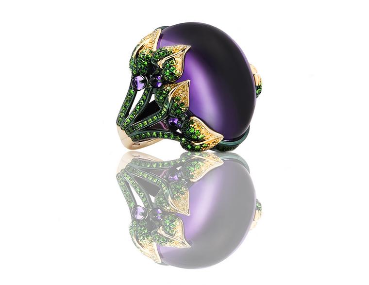
Which is good news for the jewellery industry as this is another colour that, like Emerald Green, has a jewel-bright vibrancy and a rich saturated colour that can be interpreted in amethyst, purple spinel, lilac sapphires and lavender jade.
Pantone's annual selection influences the jewellery we wear, the fashions we see on the catwalks, nailpolish and eyeshadow shades, concept cars and even the colours we choose to paint the walls of our houses with. But how does the Pantone Color Institute® go about selecting a colour that captures the mood of the year? "At Pantone we travel the world and we look for the all the clues that are out there with our colour antennae going all the time," says Leatrice Eiseman of the Pantone Color Institute® in New Jersey. "We look for what we think is emerging in the markets."
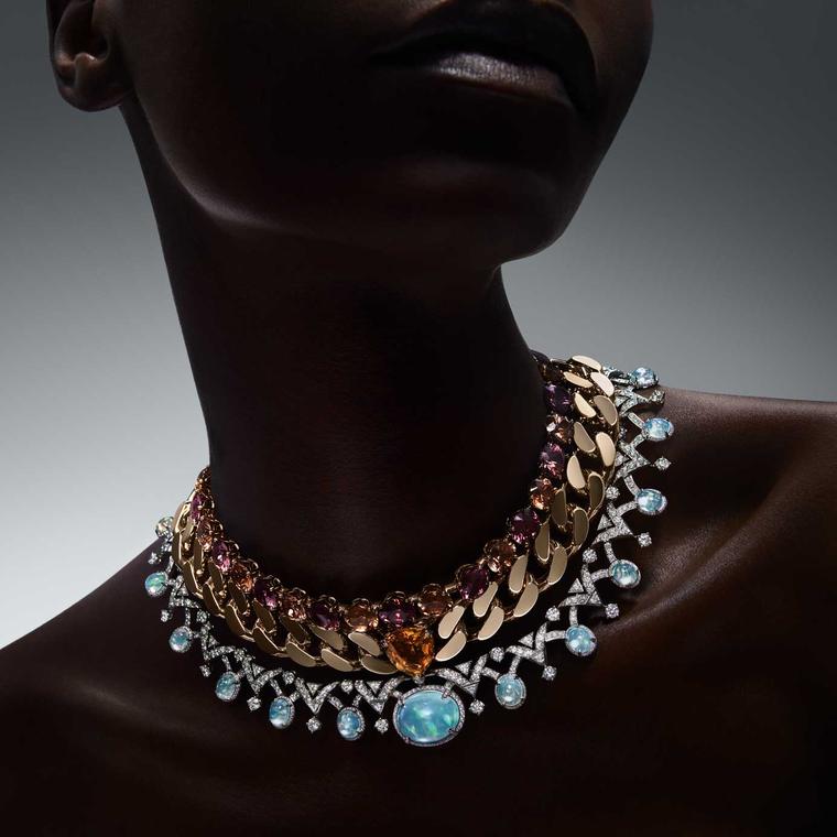
Eiseman also tells us that Radiant Orchid is of the purple family and denotes innovation and originality. According to her, it also encourages people to be more creative and inventive. Which is the perfect cue for jewellery designers to experiment with this deep, rich colour. Here is our selection of some of our favourite designs of the year that incorporate the colour purple.


