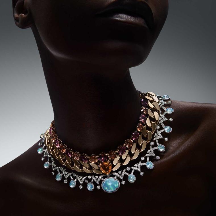
Some years it is all about blue, then there has been plenty of green, while last year we were all over Barbie pink. Thank you TAG Heuer and your Carrera. This year at Watches & Wonders it was all change as bright colours were banished from watch dials (almost) and replaced by the most sophisticated and stylish palette of neutrals, which are best described if you have ever heard of the famous British paint brand as Farrow & Ball colours.
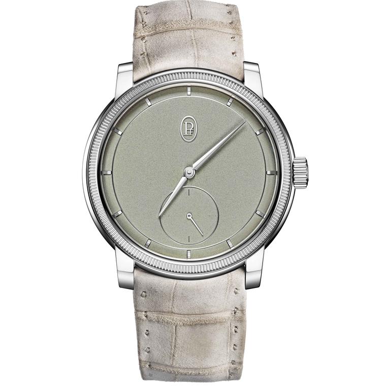
Beloved of interior designers and noticeably car manufacturers (if you’ve spotted those sage, clay, putty, mocha and stone colours recently driving around town), these richly pigmented paint colours in powdery pale tones have a wonderfully calming effect which is appealing to watchmakers. They are timeless, liveable colours that are beautifully summed up in the nuanced colour palette of Parmigiani Fleurier’s Toric collection with sand, stone, celadon green minimalist dials set in rose gold or platinum cases with toning straps.
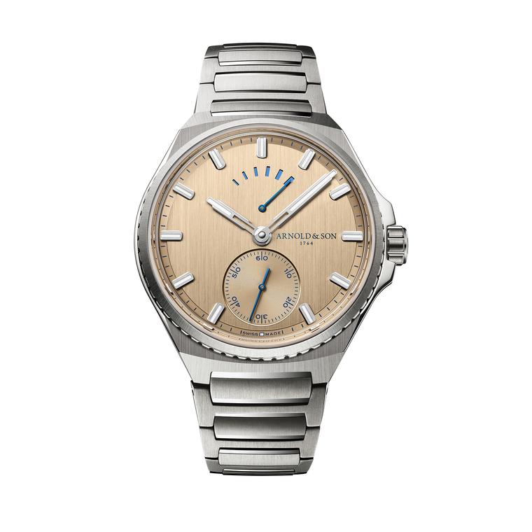
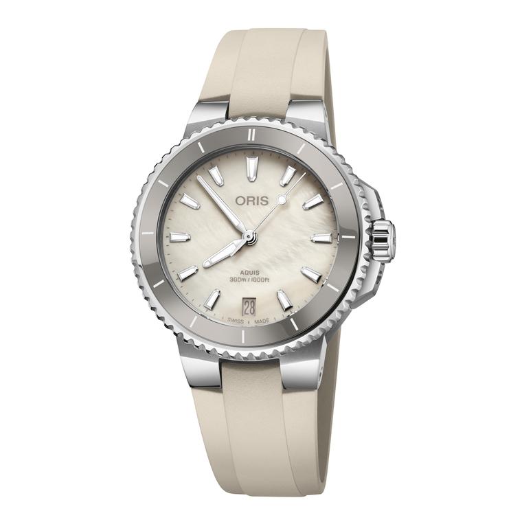
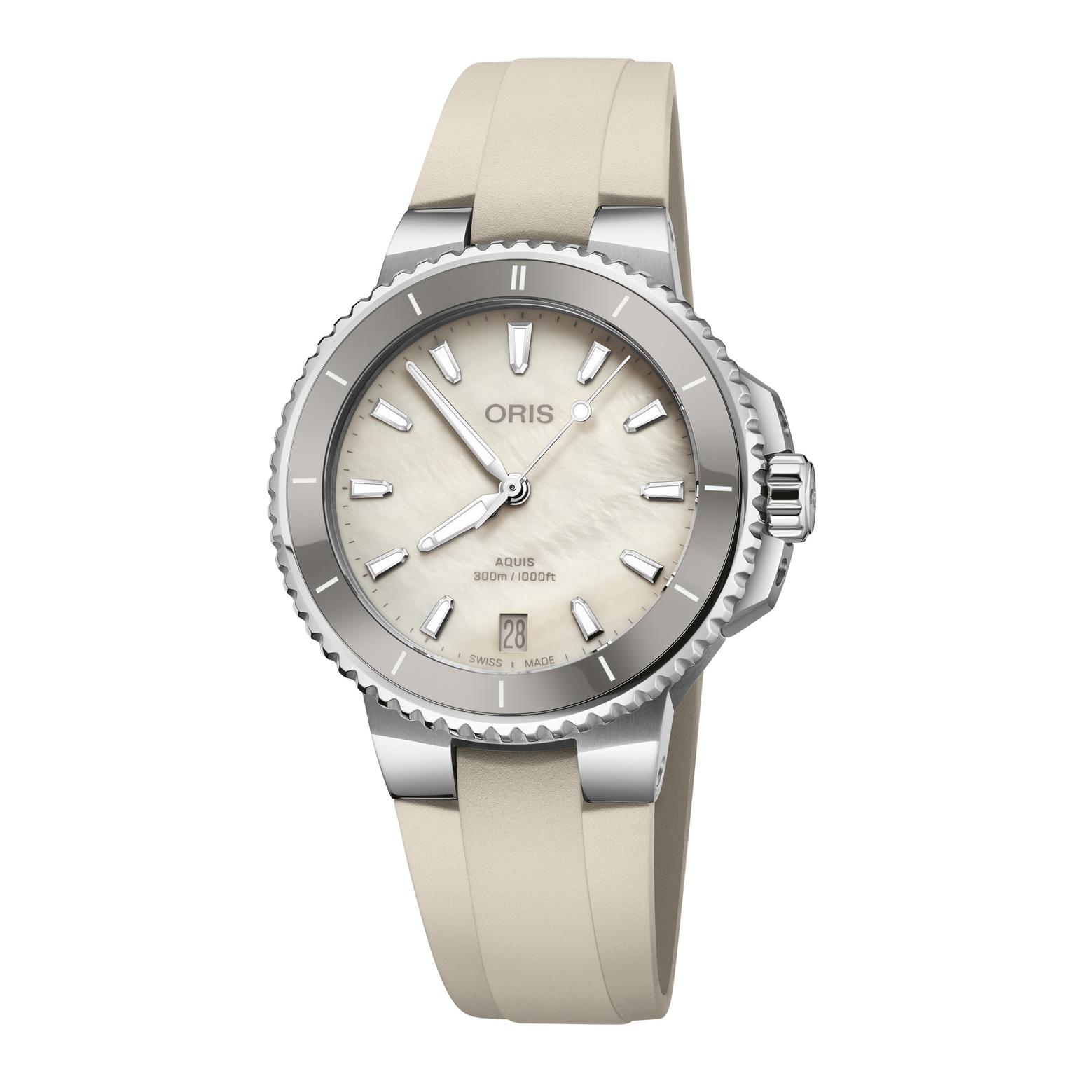
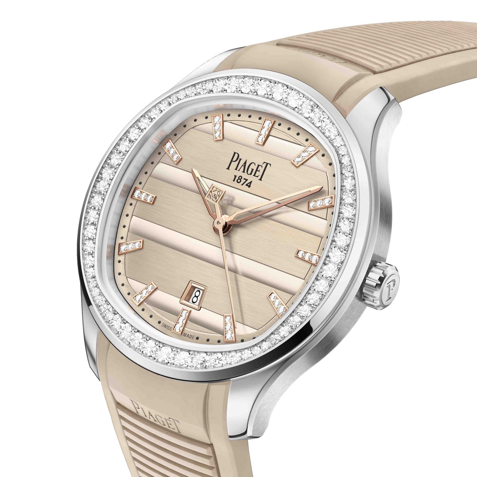
Piaget’s 150th anniversary Polo Date is in a shade that Farrow & Ball would call Oxford Stone with a diamond bezel and matching rubber strap. Elsewhere, Oris has gone for putty grey tones for its Aquis Date diver while Arnold & Son has chosen a cool sand for its Longitude Titanium watch, called Kingsand gold inspired by the sandy beach near John Arnold’s birthplace in Cornwall.
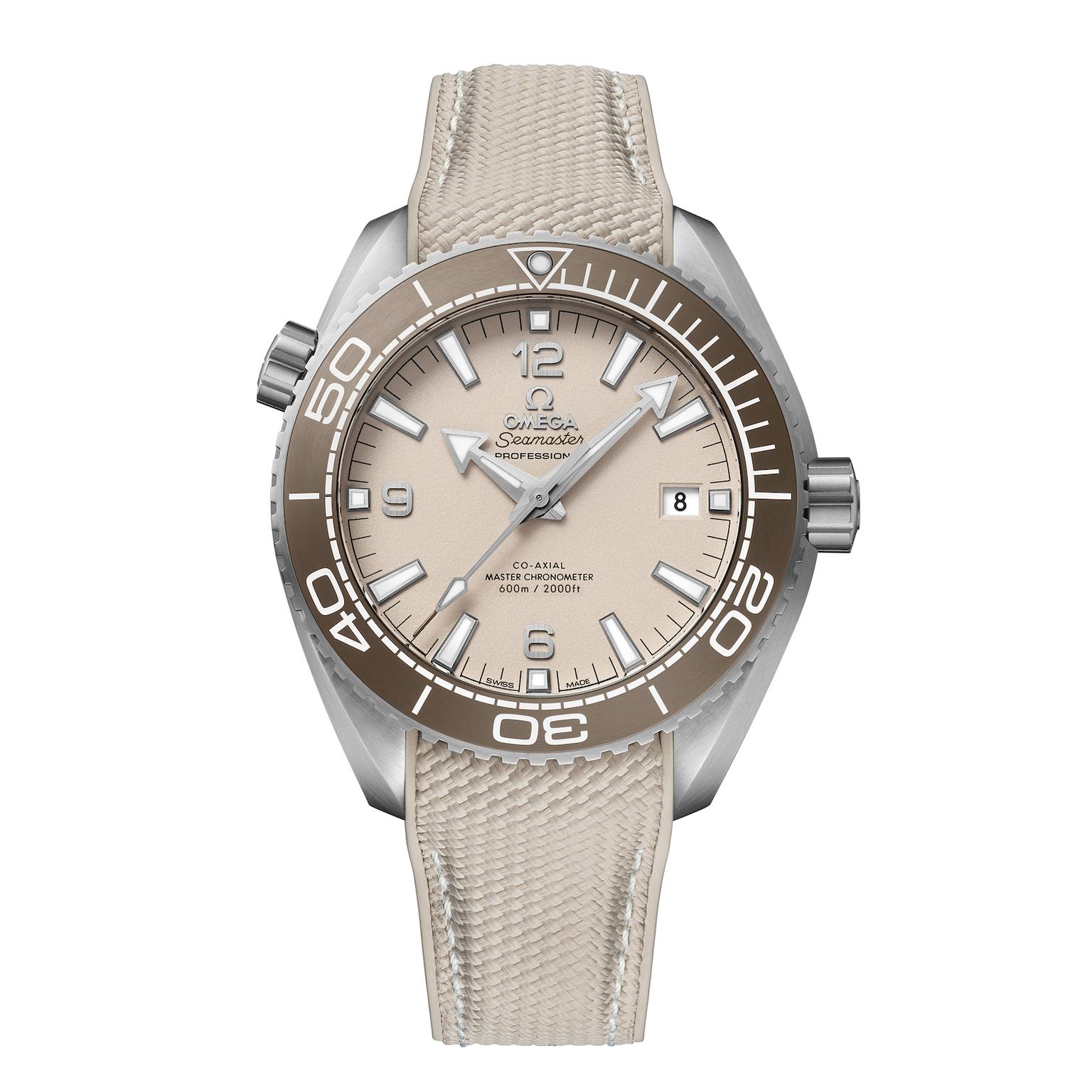
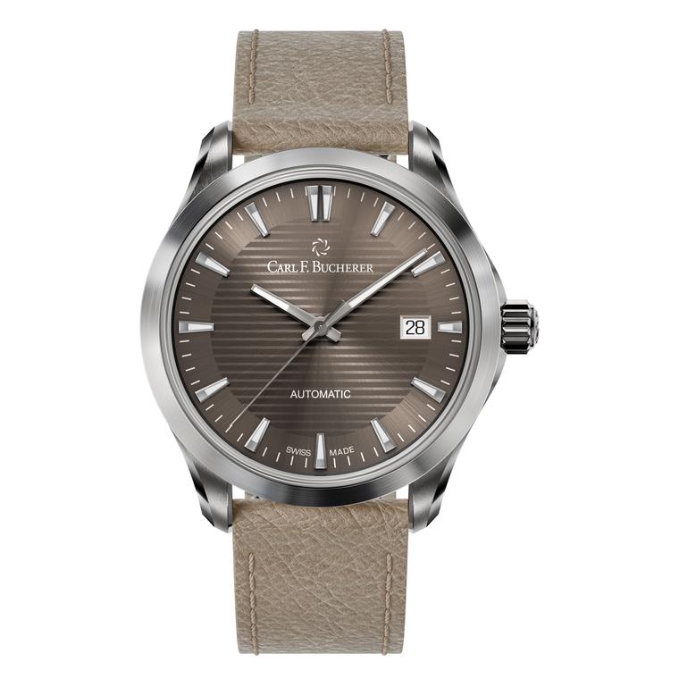
Carl F. Bucherer have picked mocha and sand colours for the striped dials of its Manero Urban automatic date models with toning leather straps - robust and perfect for everyday wear. Omega’s new steel Seamaster Planet Ocean Diver master chronometers similarly take on these subtle shades for the dial and straps, in particular the model with the sandblasted beige varnish dial and bronze ceramic bezel.
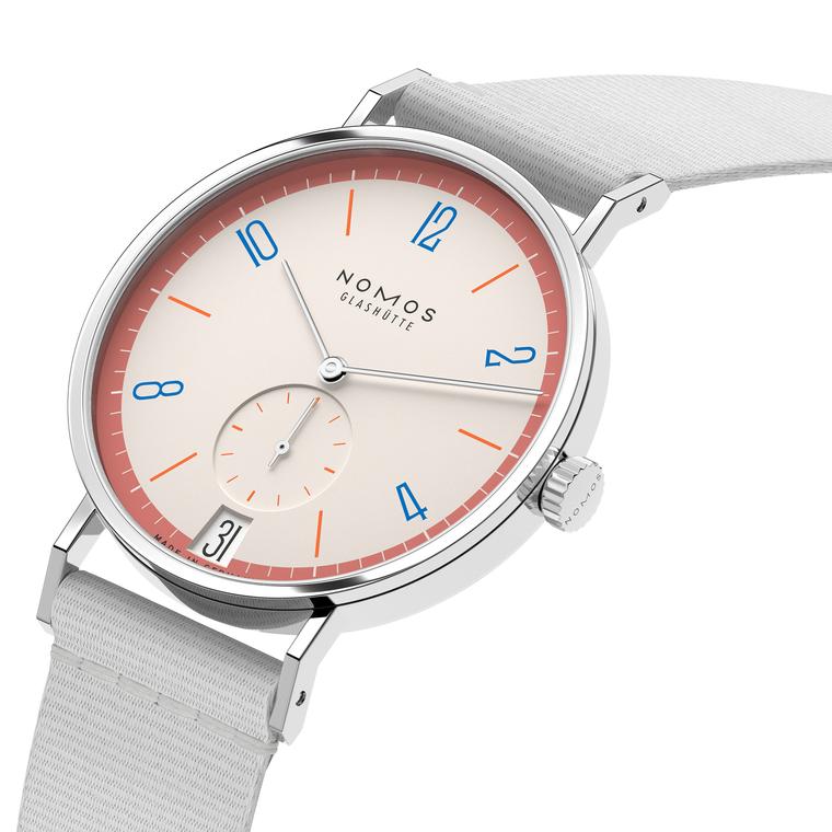
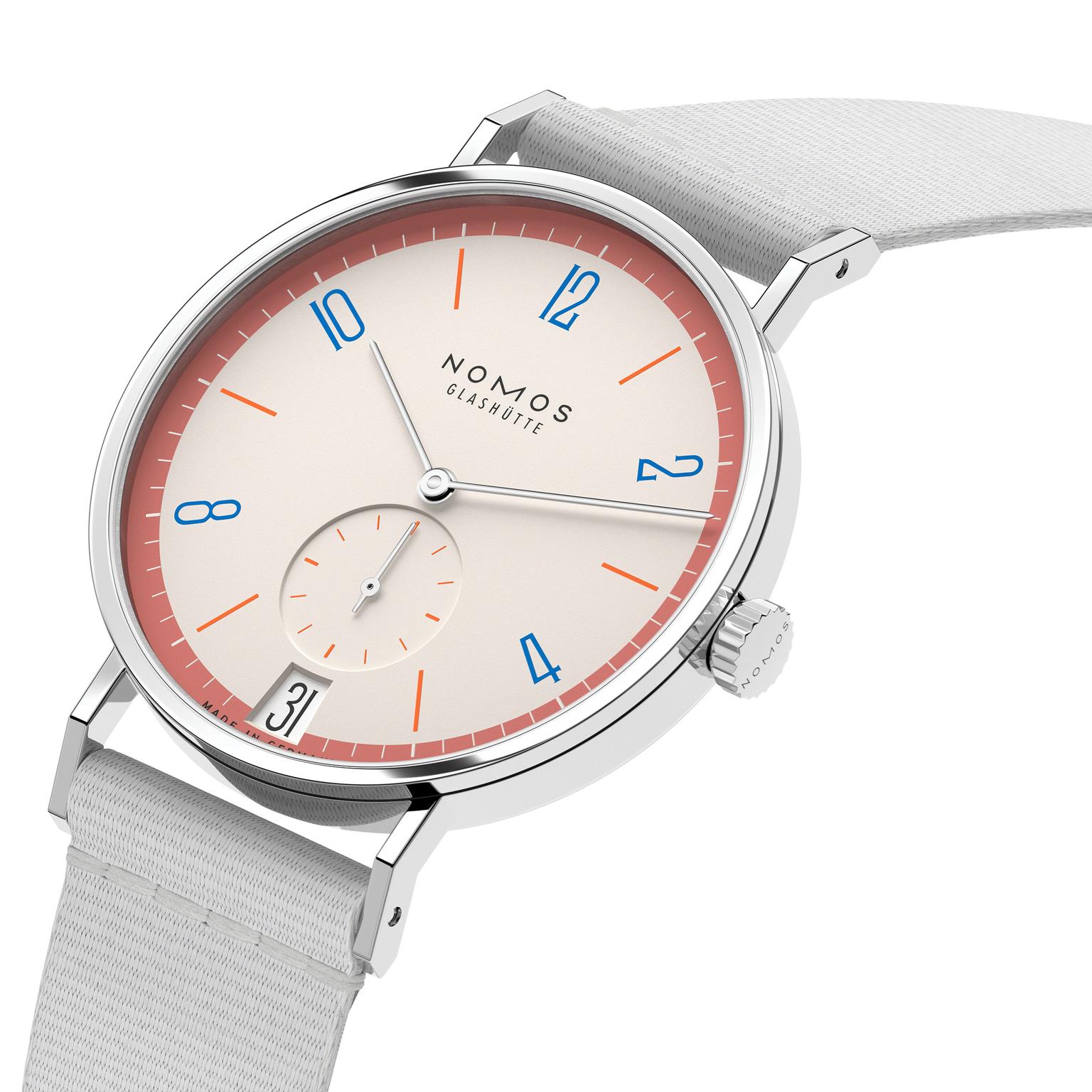
Nomos Glashutte this year went big on subtle colour combinations, 31 in all, for their bestseller Bauhaus-inspired Tangente model. The minimalist dial with the date and seconds windows of their special edition Tangente 38 date comes in playful two and three-colour combinations with a contrast colour painted around the rim. Nomos is known for its colour expertise and here they have developed bright tones, think chilli and flamingo pink, but also incredibly understated combinations like a creamy white dial with a dusky rose rim and blue numerals. In limited editions of 175 for each colour combination there is lots of room for individuality. Given how swiftly time seems to pass looking at the tranquil colours on a watch might actually offer a moment of calm.